Try these before you go overboard with SEO
Here are 5 tips to improve the SEO of your website. Search engine optimization (SEO) can seem like an impossible game with ever changing rules against an unseen opponent.
It’s tough that every single website is at the mercy of Google’s algorithms. If your business website doesn’t rank well with Google, many potential clients will have difficulty finding you.
Though many details of Google’s algorithms are covered in proprietary mystery, the design of your website and the user experience both play an essential role in search results. Design is probably the most often overlooked aspect because most website developers are not actually designers, nor do they typically have a business or marketing acumen.

An individual I recently did a website for to sell and promote his new book told me the previous company built a website that could “do everything except sell my book…”
Web design isn’t just a matter of aesthetics. Well-designed websites are easier and more enjoyable to use. They engage rather than push. Engaged visitors spend more time on your site and click more links, increasing your SEO while building your brand.
Good website design is good business,
good design is good for sales and
good design is good for SEO.
Take an objective look at your website and ask yourself these five key questions:
- How easy is it to navigate your website?
- How long does your website take to load?
- Will visitors see what they came for?
- Does this website look reputable?
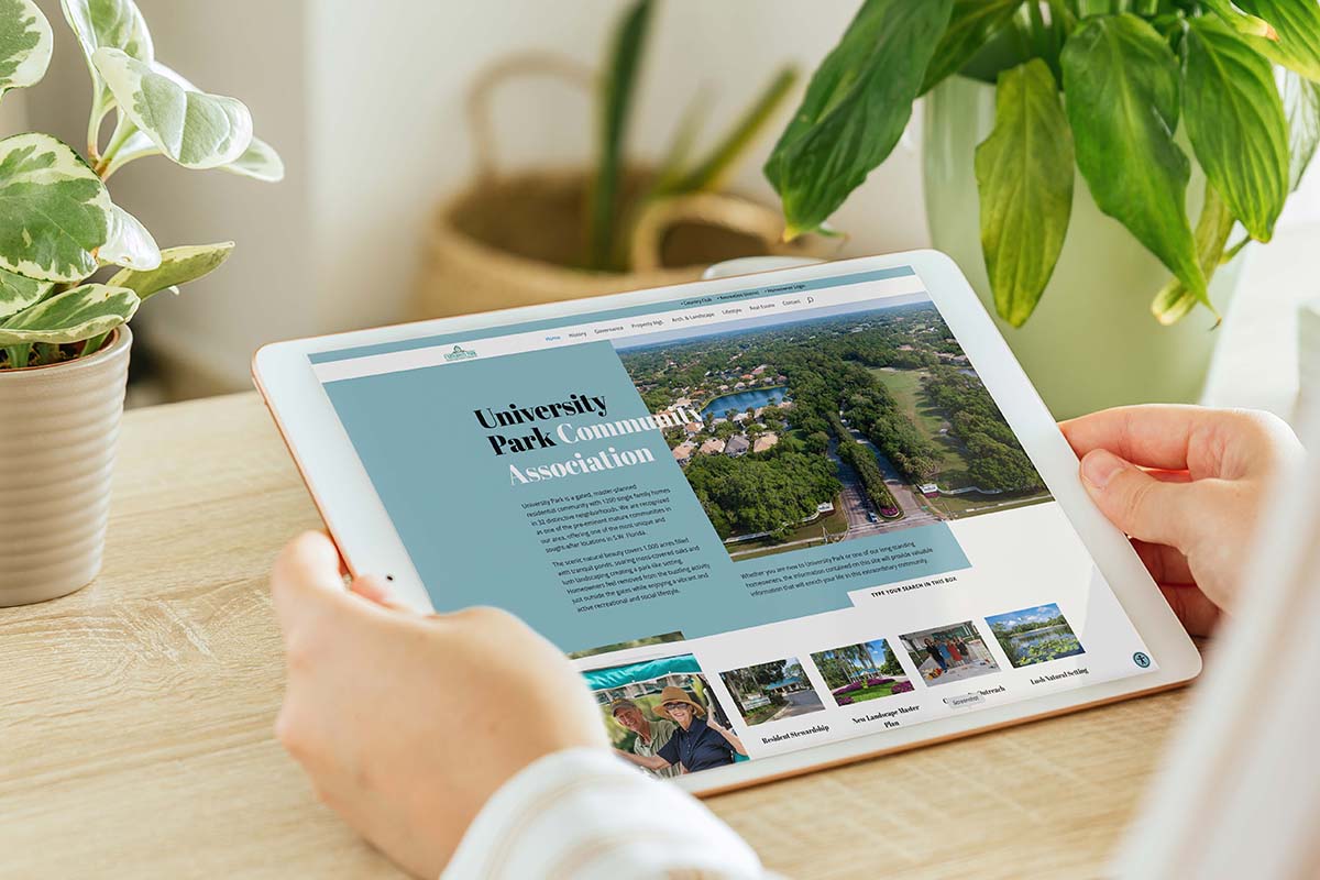
- Can I easily use this website on my phone or tablet?
1. How easy is it to navigate your website?
Let’s get real – people are busy. And impatient. OK, I’ll add lazy too. Your main navigation should have only the most important things to appeal to your most critical audience.
This is why Google pays close attention to websites navigation structures. Confusing navigation will negatively impact your users’ experience as well as your Google ranking.
2. How long does your website take to load?
Remember when we mentioned that people are busy, impatient, and somewhat lazy? One quarter of all your visitors will leave after just 4 seconds of wait time for your data to load. Again, you may be OK with that because you love the full-width video on your home page but Google doesn’t.
This doesn’t mean that you can’t use your brand assets, stunning photography or engaging video, just be careful how and why it is used. The right mix is based primarily on your individual business, not some website template or website you are trying to emulate.

3. Will visitors see what they came for?
- Make it easy to read. Provide plenty of white space and an easily readable font.
- Make every word count. Keep your website copy succinct. Use important keywords prominently and in context.
- Rank your copy by featuring the most relevant content first.
- Organize content into different sections with headers and subheaders. Different headings are easier for both humans and Google to understand.

4. Does this website look reputable?
-
-
- Prominently feature your company logo (in high-res). Pixellated or dated logos reflect poorly on your business.
- Use brand-specific graphics, colors, and fonts. A consistent brand appearance helps visitors confirm that they’ve found the right business.
- Be transparent. Use precise language, don’t hide customer support contact info, share pricing, and include FAQs to help visitors quickly learn what they want to know.
- Use plenty of white space. Simple web design with ample white space makes it easy for visitors to read, create a sense of peace, and show that you don’t need to hide behind busy graphics or confusing language.
- Showcase security features. Reassure users by showing any appropriate security badges for your e-commerce site or encryption features for keeping user data safe.
- Proofread and test for errors. Fix any spelling errors, broken links, or invalid image files. If your website is full of mistakes or doesn’t work properly, people will assume the same of your business.
-

5. Can I easily use this website on my mobile device?
Today, more people access the internet using their phones or tablets than desktop computers. Most studies show that about 65% of web traffic in the U.S. comes from mobile and tablet users.
Finally
Want to learn a little more about how Google algorithms work visit:
https://www.google.com/search/howsearchworks/algorithms/
If you have any questions about SEO, polishing up your website or building you a new one, please contact contact Imagica via email or calling (941) 350-9064


