At Imagica we get asked to do lots of logos, usually by new business that have yet to develop an identity or, on occasion, by an existing business that has grown beyond what was initially crafted. Logos represent one of the most difficult tasks for most designers because they are so deeply personal and can break all the rules of sound design. Here are just a few logo design tips to consider.
It’s depressing to have a design idea that has taken several hours dismissed by a glance in just a few seconds. Because they are so highly personal it’s only 50/50 that my favorite design submitted to the client is ultimately chosen.
The logo is one of the most important elements of your brand and hopefully just behind the attributes of your product or service. So if you are in the market now or maybe in the future, here are a few things to keep in mind:
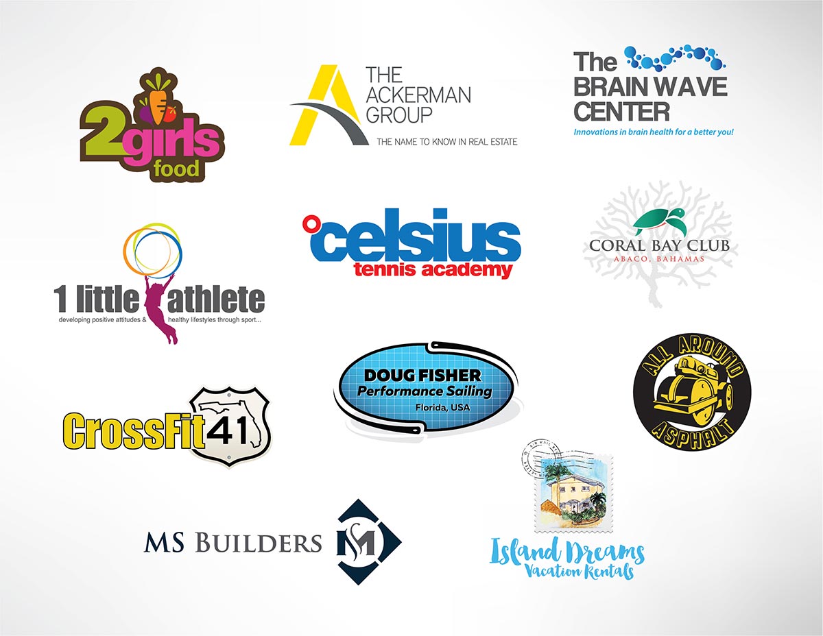
Here are some examples from a variety of small business to give you an idea of different styles and shapes.
Strong and Balanced
Whether it is just text or a graphic or a combination of both your logo should reflect YOUR business. It should be part of you, your heart and soul if you will. You’ll want your logo to reflect the personality of your business and what you do as well so it doesn’t look like it’s coming from left field.
Simple
Simplicity is key. A complex logo that is trying to be too literal or say too much will be hard to reproduce and may not fully engage your audience. Think about the most famous brands and their logos like Apple, Nike, Target and so on. They all have logos that are very simple and easy to recognize when printed just by themselves or in black and white.
Memorable
A logo doesn’t always have to describe literally what a business does. Do you see car manufacturers with pictures of cars in their logo? If you use an icon in your logo consider as examples ones that can communicate the brand without having the company name next to them.
Flexible
The same logo needs to be flexible enough to be printed on a big billboard from 100 yards away and printed on a business card and visible from a few inches. The very same logo needs to be able to be embroidered on clothing, printed on a t-shirt or even reproduced by your child on a chalk board. A good logo will work well printed in multiple colors and look just as good in black or white.
Make sure your logo is used in the same format on all of your marketing materials
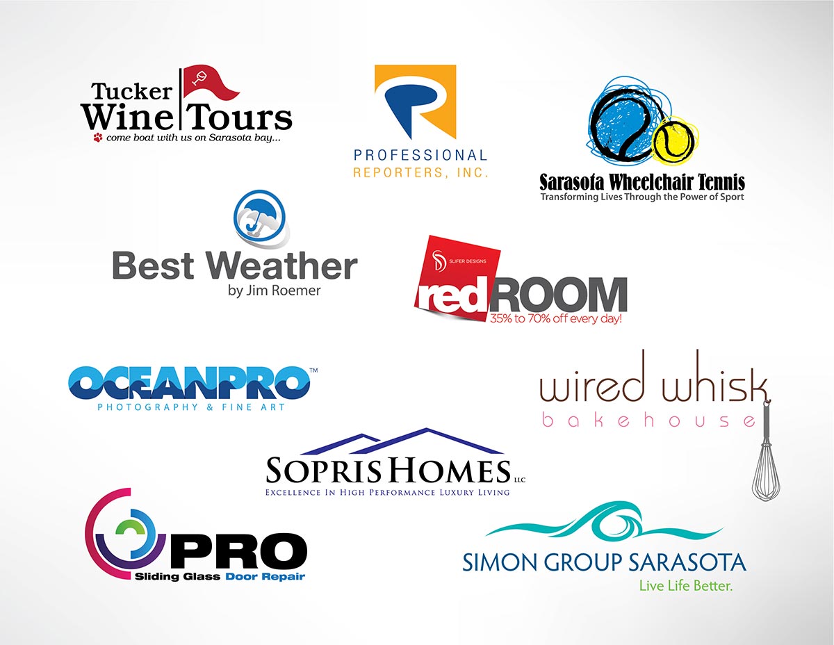
Because the primary application of so many logos today is for online branding, horizontal logos tend to be more popular than they once were with an aspect ratio of 1:3 or 1:4 but often you can modify the logo for an optimal web application and still have a square or oval shape for other applications
Colors
Colors are always a big debate for me. The more colors in your logo the harder it is to design around them in say ads, brochures, websites and so on. If your logo is one color it can be reversed out or printed in one color and essentially go with any design.
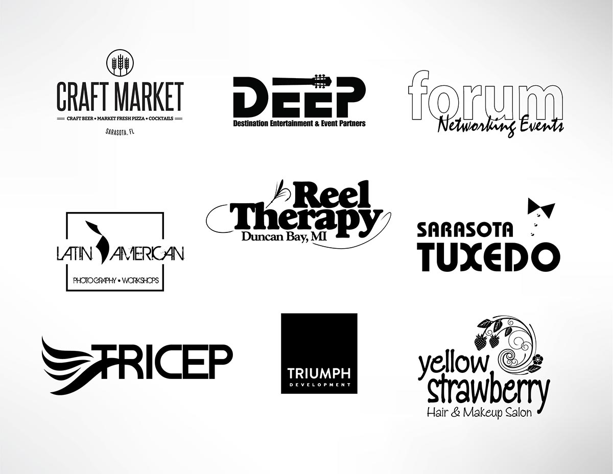
Good logos should be able to stand on their own in one color, you would be surprised as to how much more versatile your artwork will be. This principle also forces your logo to be more simple by nature.
Timeless
A logo should have a long life expectancy. Expect it to evolve and change over time just like your business does but the longer it stays at its heart, the better brand recognition you’ll get over time. The very best logos change very little but still feel fresh (think IBM, Coke, Rolex).
Unique
Will it stand out against the other clutter and crowd? Is it memorable? Try and avoid common logo cliches like swoops, pinwheels etc.
Typography
Ask yourself what you are trying to communicate. As a general rule and depending on the application, typefaces with serifs (like Times) convey a sense of dignity and power, whereas sans serifs (like Arial) convey a more clean look and offer either a sense of stability or whimsy (depending on the character of the face).
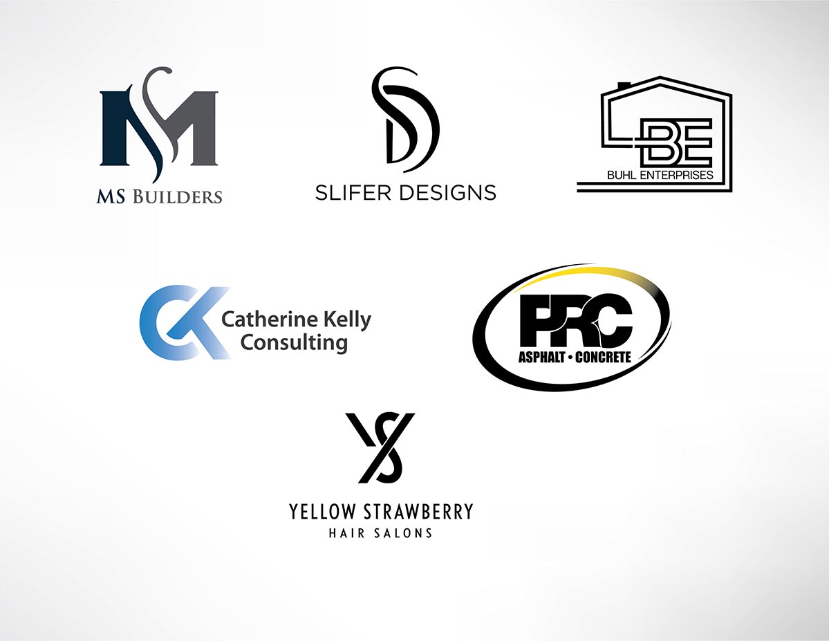
Monogram style logos can be a good choice if your company is named after a person or you are using an acronym.
Formats
Make sure you logo is in formats for all applications. I’ve met too many clients that when I ask for their logo they send me a JPEG and say that’s all they have. Your primary logo should be used most often in a vector based format like EPS or PDF then JPG or PNG for web applications.
Finally
Don’t compare your logo with already famous brands. Those brands are famous not at all because of the logo but because of the vision, hard work, committment and people behind the logo. So always remember that YOUR branding and VISION behind the logo is much more important than the logo itself.

