by Perry | Dec 5, 2019 | Commentary
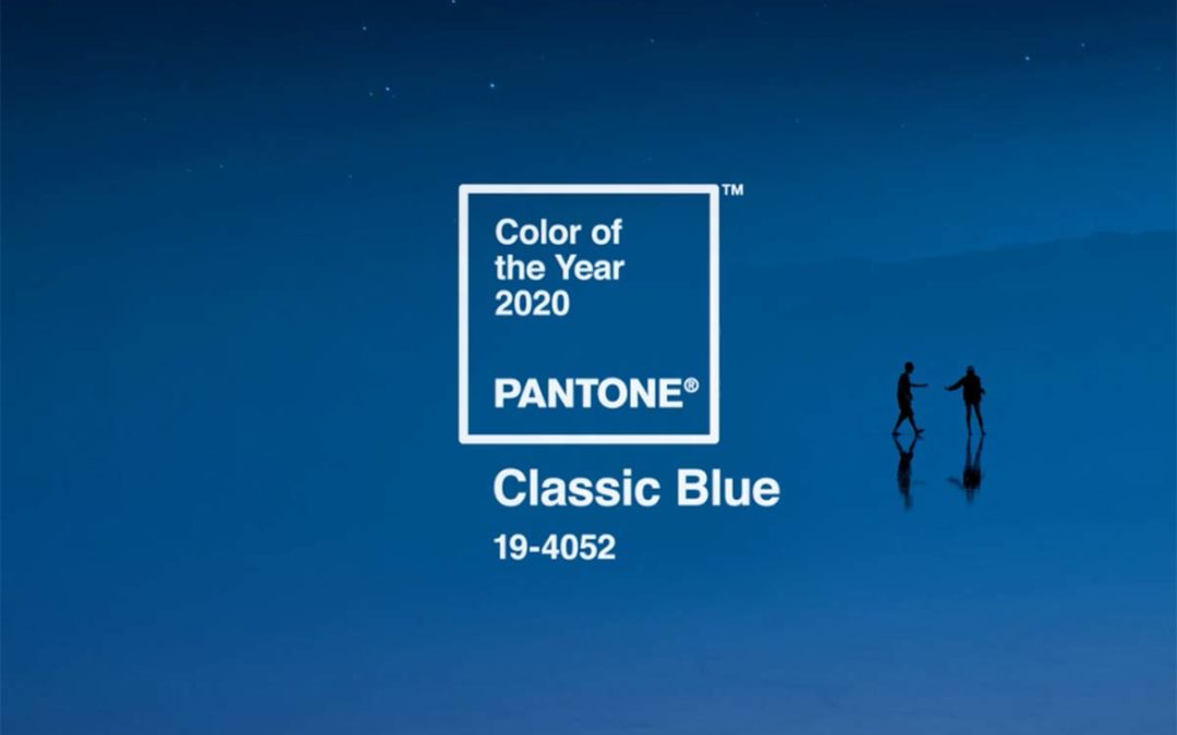
Every year I like to post the Pantone Color of the Year as I find it so interesting how it becomes sewn into our culture and very apparent in desing and advertising trends. This is truly a classic color, and just like a good cup of coffee it never gets old. Here is...

by Perry | Dec 10, 2018 | Graphic Design
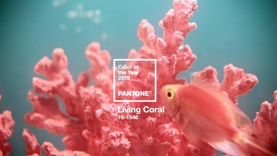
Vibrant, yet mellow PANTONE 16-1546 Living Coral embraces us with warmth and nourishment to provide comfort and buoyancy in our continually shifting environment. In reaction to the onslaught of digital technology and social media increasingly embedding into daily...

by Perry | Dec 8, 2016 | Graphic Design
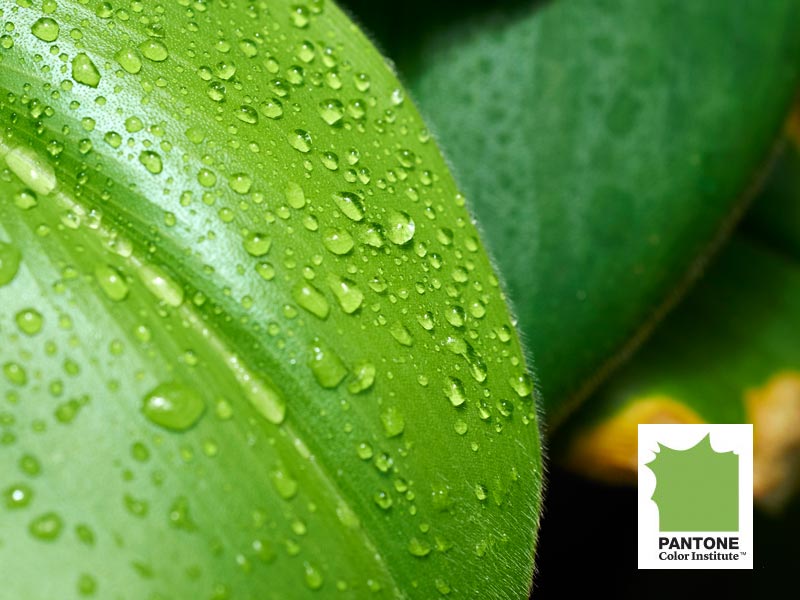
Color: GREENERY | PANTONE 15-0343 One of my favorite times of the year is when Pantone posts the new color of the year. It’s really a symbolic gesture to post an actual color that trumps all others but it’s always fun to watch that color show up as the...

by Perry | Dec 7, 2015 | Graphic Design
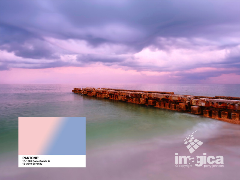
ROSE QUARTZ & SERENITY PANTONE 13-1520 & PANTONE 15-3919 Pantone®, an XRITE Company, released their 2016 Color of the year. I always like this event even if it is a little self serving because they have been a part of most every designers life since art...

by Perry | Nov 28, 2015 | Graphic Design
Imagica designs lots of logos and identity for clients of all sizes across many business sectors. Initially we choose a color scheme according to best practices that tends to use skewed towards your target audience and business sector. Often we get some “push back” as...
