by Perry | Mar 31, 2020 | Branding
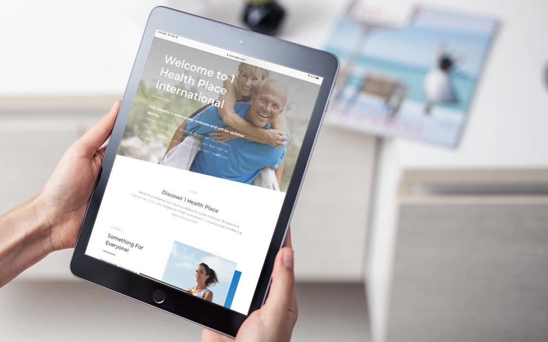
Bet many of you are finding your online presence woefully inadequate. The coronavirus is forcing the issue and is pushing traditional businesses into the digital age faster than most would like. If you are one of the old school businesses that hesitated to embrace...

by Perry | Dec 5, 2019 | Commentary
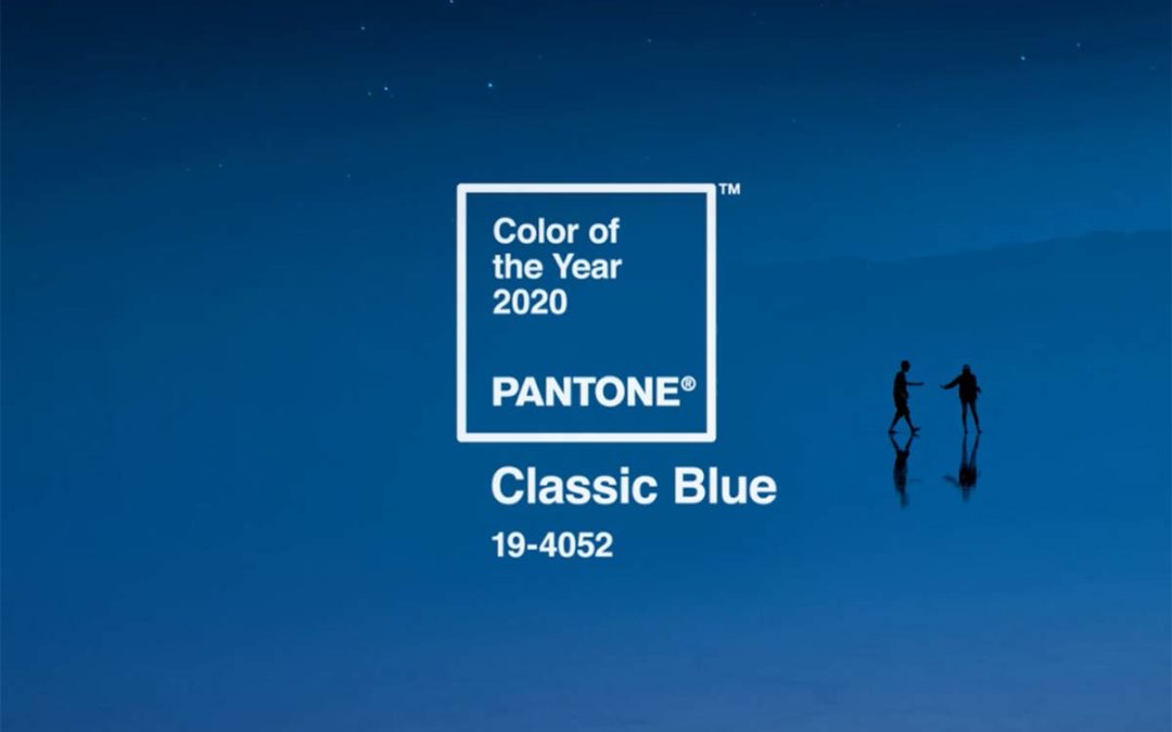
Every year I like to post the Pantone Color of the Year as I find it so interesting how it becomes sewn into our culture and very apparent in desing and advertising trends. This is truly a classic color, and just like a good cup of coffee it never gets old. Here is...

by Perry | Mar 23, 2019 | Branding
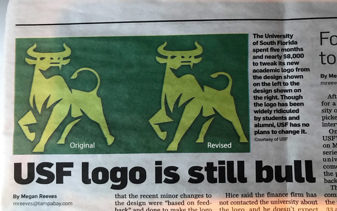
On a recent flight I was reading about University of South Florida’s quest to revise their academic logo and all the public “feedback” that came with the project. After $47K with no discernible results the university spent an additional $8,000 to revise its current...

by Perry | Dec 10, 2018 | Graphic Design
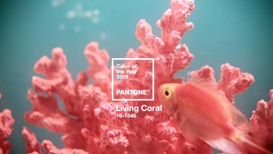
Vibrant, yet mellow PANTONE 16-1546 Living Coral embraces us with warmth and nourishment to provide comfort and buoyancy in our continually shifting environment. In reaction to the onslaught of digital technology and social media increasingly embedding into daily...

by Perry | Dec 3, 2018 | Graphic Design
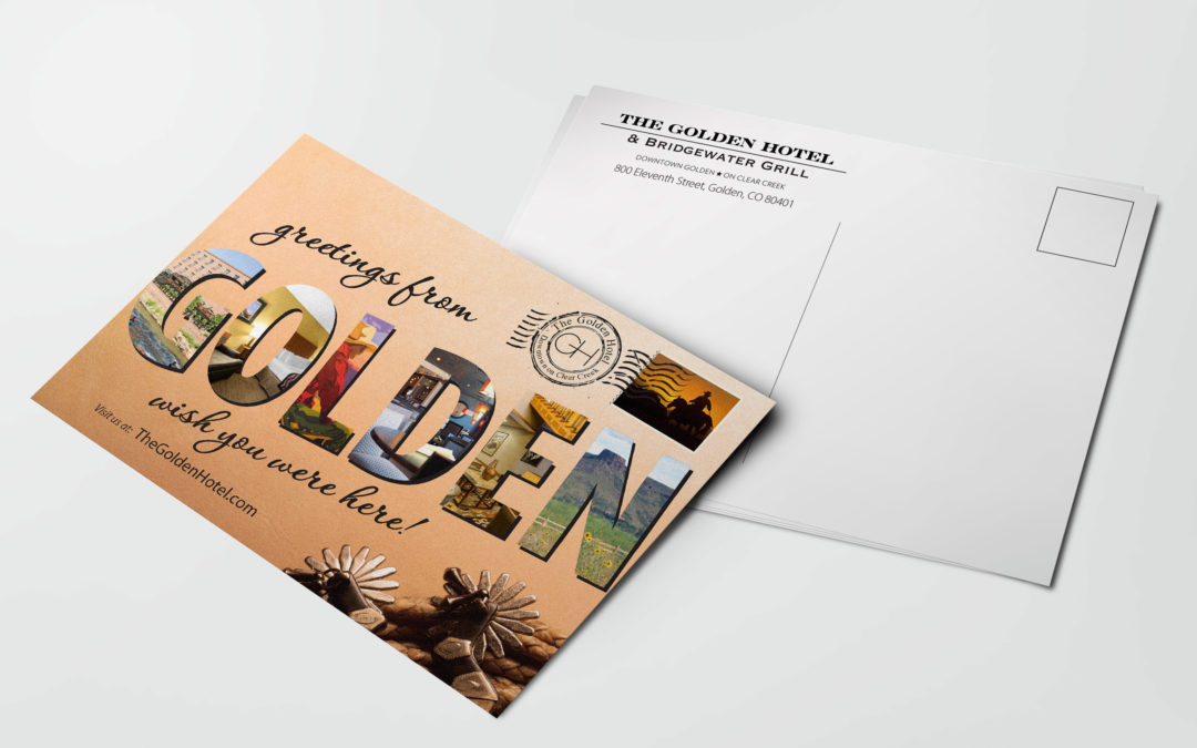
Recently we were asked by a client to resurrect a postcard that I did almost 9 years ago. This struct me as curious but they relayed to me that they found a box of cards and put them out for guests at the front desk and they were gone in less than two days. When was...
